
Thursday, 15 November 2012
Character Sheet
This was pretty complicated for me as, on top of not being very good at drawing people as it is, drawing the different expressions was quite a challenge, which is why I left it until last to do. I have no idea if I did it right and I probably should've gone into more detail, but this task was enjoyable nonetheless.

Tuesday, 13 November 2012
Final Images
The final images have gone through a few stages. The first one was from before I'd decided that the main character was from the Navy. Because of this, I hadn't yet thought of placing the town by the sea, so instead it was something fairly standard next to a river.

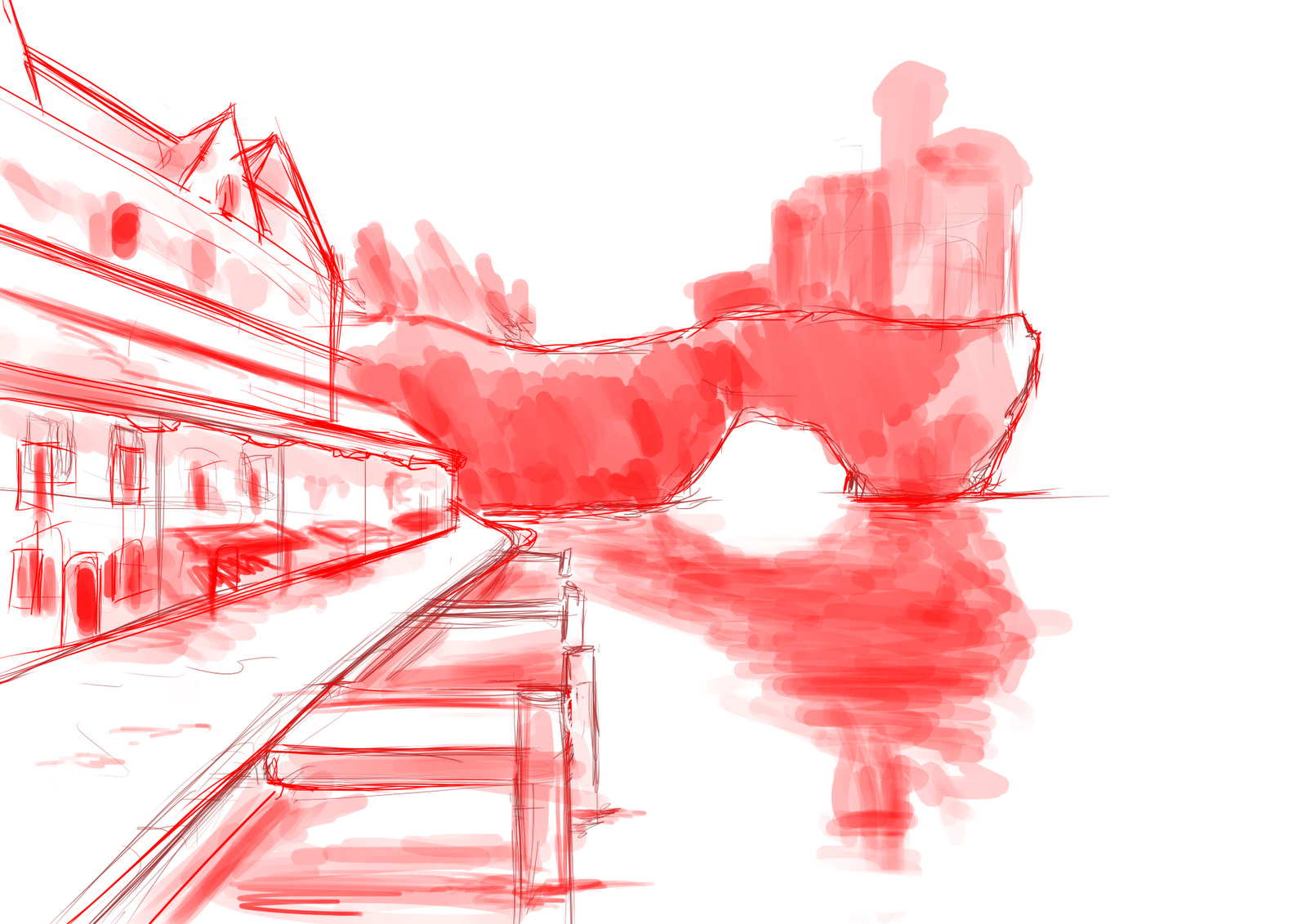
After I'd decided to move it to a port, this is the sketch that I had done.

Here is the sketch I did of the same drawing but digitally. The colouring was to give me some idea of the shadows and reflection.

I didn't really find any inspiration for any of these, they just came to mind and I just drew them down. I don't even have source material for them, save for my architecture study.

This was a really mixed thing for me. On one half of the image, I'm really proud of it, but not so much on the other. The way that the reflection on the sea water has come out of the sunset and the cliff, I'm really pleased with. However, the town on the side didn't come out so well and looks bland. Additionally, the Soldier stood on the pier doesn't seem right, but that may be because he wasn't originally intended to be in the image and was put in at the last moment as he was needed in a final image. He doesn't seem to detract from the full image though as I don't notice him when looking at the image as a whole.

In terms of composition, I like this image, but I don't like its overall turnout as I don't feel that I've used enough detail to really show off the dominance that I tried to give with the Soldier. However, I don't yet have the skill with any digital painting to be able to do any better.

This was meant to show a battle scene between the Soldier and the Witch. Having no designs for the Witch, I quickly took one of the silhouettes and threw something together using dark colours and wry hair. Again, not pleased with this image. On top of being rushed, there seems to be little depth and the background is very bland, something I could've easily done something about but didn't. Not pleased with this at all.

After I'd decided to move it to a port, this is the sketch that I had done.

Here is the sketch I did of the same drawing but digitally. The colouring was to give me some idea of the shadows and reflection.
I didn't really find any inspiration for any of these, they just came to mind and I just drew them down. I don't even have source material for them, save for my architecture study.

This was a really mixed thing for me. On one half of the image, I'm really proud of it, but not so much on the other. The way that the reflection on the sea water has come out of the sunset and the cliff, I'm really pleased with. However, the town on the side didn't come out so well and looks bland. Additionally, the Soldier stood on the pier doesn't seem right, but that may be because he wasn't originally intended to be in the image and was put in at the last moment as he was needed in a final image. He doesn't seem to detract from the full image though as I don't notice him when looking at the image as a whole.

In terms of composition, I like this image, but I don't like its overall turnout as I don't feel that I've used enough detail to really show off the dominance that I tried to give with the Soldier. However, I don't yet have the skill with any digital painting to be able to do any better.

This was meant to show a battle scene between the Soldier and the Witch. Having no designs for the Witch, I quickly took one of the silhouettes and threw something together using dark colours and wry hair. Again, not pleased with this image. On top of being rushed, there seems to be little depth and the background is very bland, something I could've easily done something about but didn't. Not pleased with this at all.
Composition Analysis

I think that this image uses the Iconic composition and a vertical Rule of Thirds. Reason being is you have the main centre piece directly in the middle and dominating the image with bright warm colours, as opposed to the framing around it which is all cool colours. The Rule of Thirds is applied to the colours, whereas the iconic composition is applied to objects. For instance, you have the boats at the bottom right at an angle, pointing almost directly at the fire, roughly following along the diagonal line. The fire and its reflection dominate the centre of the image. And to the left of the fire, you have the bridge, which flows directly into the fire, following along the horizontal line. You also have the edge of the river just below the bridge, where there seems to be thousands of people presumably escaping, which also points towards the fire.
Ideas for the dogs
Trying to come up with ideas for the dogs.
When I first read the story, the first image I got was of these huge dogs, keeping the eyes in proportion to the body (so the dog with eyes the size of towers as an absolute behemoth). Kind of also adds an unrealistic approach to the story. Maybe in-game I'd have to downsize the dogs. As I was reading however, I invisioned the Colossi from Shadow of the Colossus.


 I think there's something like 13 in total. They each draw inspiration from different things (birds, knights, bulls etc.) and the developers have turned these ideas into these gigantic stone structures (well, most are huge, I think there's two that are the size of a Rhino).
I was thinking of having something similar. Not quite as big, but some sort of mythical creature for the dogs. More than likely, these dogs are magical creatures of some form because they're summoned when the tinderbox is struck and simply seem to appear into being.
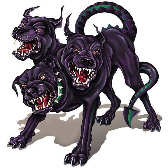
I took a moment to think of what other mystical dogs exist and very quickly remembered Cerberus, the gate guard of the Underworld. Obviously being a mythical creature, part of the designs would be down to interpretations, but the basic idea of Cerberus is a three headed dog with a serpent's tail, a mane of snakes and a lion's claws.

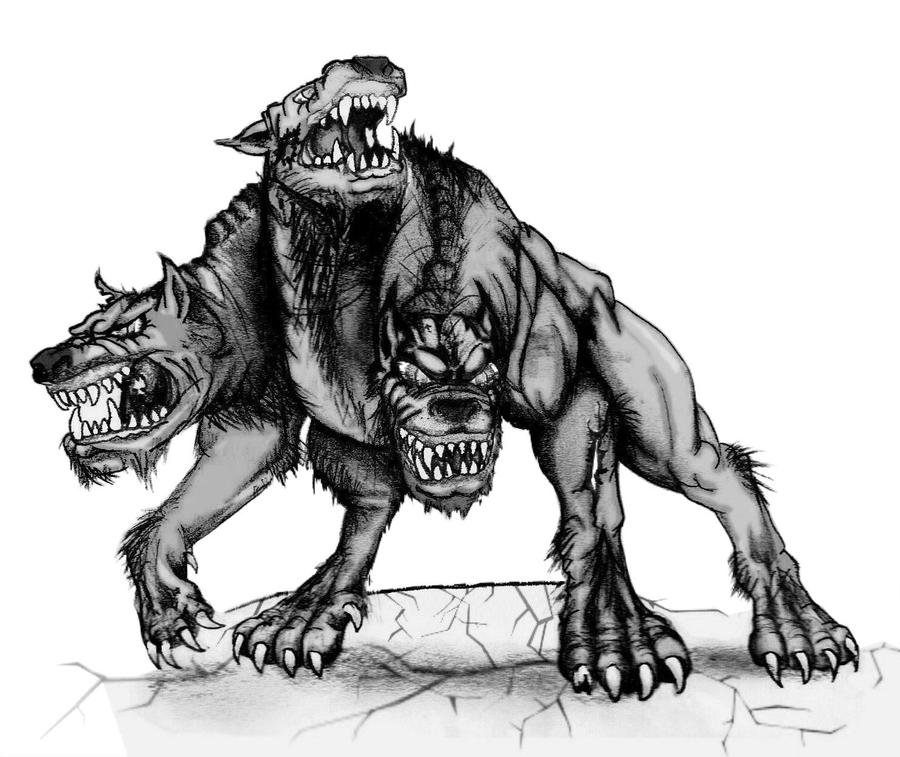
 I also looked at Fluffy, the three headed dog from Harry Potter with a direct inspiration from Cerberus. Although Fluffy doesn't guard the Underworld, he does guard the trapdoor that leads down to the Philosopher's Stone.


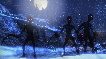
I also keep thinking of these shadow creatures. The typical kind of shadow form with smoke billowing off, red glowing eyes, that sort of thing. I wont copy this design precisely as, over the years, it's become stale, but it's something to work on.


The next step really is to come up with some silhouettes and see what happens.
When I first read the story, the first image I got was of these huge dogs, keeping the eyes in proportion to the body (so the dog with eyes the size of towers as an absolute behemoth). Kind of also adds an unrealistic approach to the story. Maybe in-game I'd have to downsize the dogs. As I was reading however, I invisioned the Colossi from Shadow of the Colossus.


I was thinking of having something similar. Not quite as big, but some sort of mythical creature for the dogs. More than likely, these dogs are magical creatures of some form because they're summoned when the tinderbox is struck and simply seem to appear into being.
I took a moment to think of what other mystical dogs exist and very quickly remembered Cerberus, the gate guard of the Underworld. Obviously being a mythical creature, part of the designs would be down to interpretations, but the basic idea of Cerberus is a three headed dog with a serpent's tail, a mane of snakes and a lion's claws.

I also keep thinking of these shadow creatures. The typical kind of shadow form with smoke billowing off, red glowing eyes, that sort of thing. I wont copy this design precisely as, over the years, it's become stale, but it's something to work on.

The next step really is to come up with some silhouettes and see what happens.
Model Sheet
The selection of colours was simple - I looked at how their clothes were designed and picked out the main colours. For Napoleon's Navy, there tended to be Royal colours, such as rich blues and reds and normally the clothing had a gold trim.
 I wasn't particularly pleased with this drawing as there are several things off with it, so I went back and redid the model sheet in a more conventional way. I also retouched some of the colours to make them more vibrant as I felt the previous palette was too grey.

I also went to draw a very quick headshot of the character. Although I got the position of everything right, I'm not very happy with the hat as it turned out too flat and the wrong colour. I should go back at some point and correct this really.


I also went to draw a very quick headshot of the character. Although I got the position of everything right, I'm not very happy with the hat as it turned out too flat and the wrong colour. I should go back at some point and correct this really.

Wednesday, 7 November 2012
Architecture
For the environment work, I decided to have a look into the French architecture.
From what I can find, France has quite a wide variety of architecture due to its history. It has Roman, Gothic, Italian influences (from the Renaissance), Baroque and Rococo.
In terms of the Renaissance buildings, it's more of an altered version of Gothic rather than a new style. Architects took influence from the Italian Renaissance style and applied it to Gothic, altering the Italian techniques to suit French tastes.
When Napoleon came into power, he made sure he could dominate the country. To assert his power, he applied Ancient Roman architecture to their style. Napoleon took Classicism, applying a neo-Classic style to the architecture to assert his power and it extended through the early 1700's, early 1800's (when Napoleon was in power) and managed to survive right up until the early 1900's. He did this because, of course, the Romans are considered as one of the most powerful military strengths the world has ever seen and Napoleon used this to assert his power.
So the architecture around the Napoleonic era had a heavy influence from Roman culture, which is what I'll be focusing on. Maybe for older buildings, I could also apply the previous architectures (but at this stage, I probably shouldn't have to).
Reference: http://www.safaritheglobe.com/history_france.aspx 12:00 06/11/2012


In each of these you can see influences from the Roman empire - supporting pillars, intricate designs, all trying to assert power in some way.
The second image is from Ljubljana, a city built during the Napoleonic period, being on either side of the Austrian Empire and for some time on Yugoslavia. Considering its architecture would be mostly Napoleonic, it's probably wise to look further into this city.
Reference: http://princess-ville.blogspot.co.uk/2012/04/from-israel-back-to-europe.html 14:09 06/11/2012


Ljubljana has its own castle, so it's probably a good idea start there in terms of inspiration for the castle.

I also had a look for "the best castles of France" to see what kind of elegant castles they have and draw inspiration from those as well.
Tuesday, 6 November 2012
Understanding the Tricorn
Been having a lot of trouble trying to draw the Tricorn, so I pulled the design to one side and opened the folds out so to speak, so I could better understand how it works so I could draw it better.

You have the centre of the Tricorn like a generic hat, just sits on the top of your head. Then, there's a triangle with rounded corners going outwards, which fold in. I think I've done this example too flat though, as the corners tend to point outwards rather prominently.

You have the centre of the Tricorn like a generic hat, just sits on the top of your head. Then, there's a triangle with rounded corners going outwards, which fold in. I think I've done this example too flat though, as the corners tend to point outwards rather prominently.
Sunday, 4 November 2012

Saturday, 3 November 2012
Research and Inspiration Sources
Just going to post a whole load of images and sources that I've taken research and inspiration from.
I started off with looking at Napoleonic clothing, namely of soldiers. This was pretty simple, using Google images and looking at the drawings that had been made in that era.
 This first one (above) is, as you can see, a British soldier with full kit in use between 1806 and 1820. Although it's a British uniform, it's easily discernible as Napoleonic era (something I had realised early on was that that soldier doesn't have to be French, so it was a good idea to look at a few Nations' uniforms). Very typically, uniforms in this era were designed both to be durable and very pronounced (as opposed to today's uniforms which, although still durable, are designed to be more practical and camouflaged).
[Taken from the source, to give me a better insight into how the uniforms were designed] NOTIONS: Linen hand sewing thread, reproduction buttons, reproduction lace. Buttons - The number, size and form of buttons varied by corps, although most coats of battalion or grenadier enlisted men or sergeants required 18 large "coat" and 12 small "vest" buttons, while light infantry coats were usually fully trimmed with small buttons. Lace - Enlisted lace was 1/2 inch wide of distinct regimental pattern. Although the amount varies by regiment or corps, it generally required 12 yards of worsted regimental lace to trim the buttonholes and edgings of enlisted men and sergeants' coats, while drummers' or music coats required 28 to 32 yard.
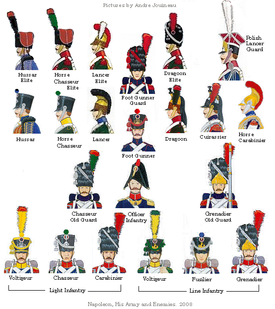
 An insight into the hats used. Like the rest of the uniforms, there were many hats used by the infantry to signify their role. However, I don't think these were all of the hats used, just a basic idea. For instance, the picture above with the British Soldier has a different hat to all of these. Despite saying at the bottom "Napoleon, His Army and Enemies" it doesn't seem to have them all. Saying that, it doesn't have Napoleon's hat either, as shown below.

 The hat above, a Bicorn, is one of those actually worn by Napoleon, at least according to its source.

Above is a tricorn.They were normally used by sailors, including the Navy. They came in a wide variety of styles, from the simple (like above) to the elegant (such as over-the-top designs with lots of feathers like you see in Pirates of the Carribean). They were also the basis for the later-to-be Bicorn (above, Napoleon's hat).
 An example of Tricorns in use by soldiers. Just to clarify that they were used. I also think they look pretty cool, so I might use these. On top of that, their dress coats are very nice too. These are probably going to be the basis of my soldier really.


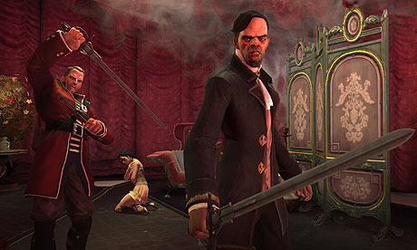
Been playing this game a lot, Dishonored. It's a mix of different eras and styles. In terms of technology, it's much like Steampunk. Architecture, I'd say Pre-WW1 London style. The clothing, Napoleonic. As you can see above with the exploding soldier, he's wearing what is easily discernible as Napoleonic clothing.


I also had a look into Fable 3, which actually has the same kind of style to Dishonored (and looking at the similarities in art style, clothing and setting (both have Steampunk features) Fable probably influenced Dishonored).


Captain Jack and his Tricorn hat. Could also help with how it sits on the head as I can't seem to get it right while drawing.
 Someone also suggested I have a look at "Hornblower," a TV series from 1998 to 2003 which was about the Navy in Napoleonic period. Not sure what else to say really, since I haven't watched it. However, images are useful for uniforms.


Can't seem to find any full body shots.
I started off with looking at Napoleonic clothing, namely of soldiers. This was pretty simple, using Google images and looking at the drawings that had been made in that era.

[Taken from the source, to give me a better insight into how the uniforms were designed] NOTIONS: Linen hand sewing thread, reproduction buttons, reproduction lace. Buttons - The number, size and form of buttons varied by corps, although most coats of battalion or grenadier enlisted men or sergeants required 18 large "coat" and 12 small "vest" buttons, while light infantry coats were usually fully trimmed with small buttons. Lace - Enlisted lace was 1/2 inch wide of distinct regimental pattern. Although the amount varies by regiment or corps, it generally required 12 yards of worsted regimental lace to trim the buttonholes and edgings of enlisted men and sergeants' coats, while drummers' or music coats required 28 to 32 yard.


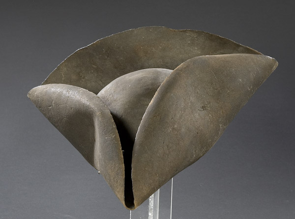
Above is a tricorn.They were normally used by sailors, including the Navy. They came in a wide variety of styles, from the simple (like above) to the elegant (such as over-the-top designs with lots of feathers like you see in Pirates of the Carribean). They were also the basis for the later-to-be Bicorn (above, Napoleon's hat).


A reference for myself to try and better understand how the tricorn sits on the head. The basic idea is that the three sides fold in and clip to the main base of the hat. The corner at the front is also designed to let water drip out of the front. (Possible game mechanic to make something harder? End up in rain, vision partially obscured by dripping water from the hat.)


I also had a look into Fable 3, which actually has the same kind of style to Dishonored (and looking at the similarities in art style, clothing and setting (both have Steampunk features) Fable probably influenced Dishonored).


Captain Jack and his Tricorn hat. Could also help with how it sits on the head as I can't seem to get it right while drawing.


Can't seem to find any full body shots.
Monday, 29 October 2012
Study of light
For this part, I simply have to analyse a painting about its light, and for this I chose a 3D model called "Celebration" by an artist on DeviantArt called Drea Horvath (or "00AngelicDevil00").

As you can see, the first immediate light sources are the Chinese lanterns on the water and floating off into the distance in the sky. They are each their own light source. The paper of the lanterns also bounce the light around inside, sub-surface scattering, giving the objects a soft orange glow, iconic of the product. Additionally, you have them all reflecting off of the water, which I think is specular reflection as the light is reflected directly at you. You also have another light source coming from the tower, presumably multiple sources from each room. Considering the colour of the light and the fact it seems to be lit by fire (judging by the colour and comparing to the visible light sources) I would take a guess that this is all bounced light, diffused reflection off of the surfaces of the surrounding walls. Finally, in the right of the image where you have the cooler blues in contrast to the warm red lights, the sky is lit up in a moonlight blue. The clouds are clearly visible and completely blocking the night sky, but due to their glow I can assume there is more bounced light inside the clouds which gives a soft light across them and again reflected on the surface of the water. Because of the distance of the objects and no land or anything similar in the foreground (which would probably mean the camera would be in the centre of the lake), there is no visible objects under the surface of the water.

As you can see, the first immediate light sources are the Chinese lanterns on the water and floating off into the distance in the sky. They are each their own light source. The paper of the lanterns also bounce the light around inside, sub-surface scattering, giving the objects a soft orange glow, iconic of the product. Additionally, you have them all reflecting off of the water, which I think is specular reflection as the light is reflected directly at you. You also have another light source coming from the tower, presumably multiple sources from each room. Considering the colour of the light and the fact it seems to be lit by fire (judging by the colour and comparing to the visible light sources) I would take a guess that this is all bounced light, diffused reflection off of the surfaces of the surrounding walls. Finally, in the right of the image where you have the cooler blues in contrast to the warm red lights, the sky is lit up in a moonlight blue. The clouds are clearly visible and completely blocking the night sky, but due to their glow I can assume there is more bounced light inside the clouds which gives a soft light across them and again reflected on the surface of the water. Because of the distance of the objects and no land or anything similar in the foreground (which would probably mean the camera would be in the centre of the lake), there is no visible objects under the surface of the water.
Silhouettes
Apparently, Blogger doesn't like uploading photos. So this took way longer to upload than it should have. Partially also down to my own procrastination in trying to find a workaround as well, but that's not the point.
To start off my character design, the task was to come up with 100 silhouettes, different general shapes of that the character I'm designing could look like (in this case, the soldier).

Very nearly hit the 100 mark, then I realised I'd just started drawing random shapes and couldn't really come up with anything else after.
One problem I had come across during this was the solidity of my idea, if that makes sense. I'd done about 20 silhouettes before I looked and said "yeah, this is what I want" and after that I couldn't really generate anything else. It wasn't until later, when I had already started my iteration of the soldier, that I came up with fresh ideas as to what to add to the silhouette sheet. On top of more looks of what the soldier could look like, I remembered that he doesn't have to be a he - it could be a she. So I started doodling a few female forms as well in different shapes and sizes. Although some aren't really fitting for a soldier (and some probably gear more towards the witch) they're still ideas at least.
Subscribe to:
Comments (Atom)